Section 2
Design Guide
Personal work
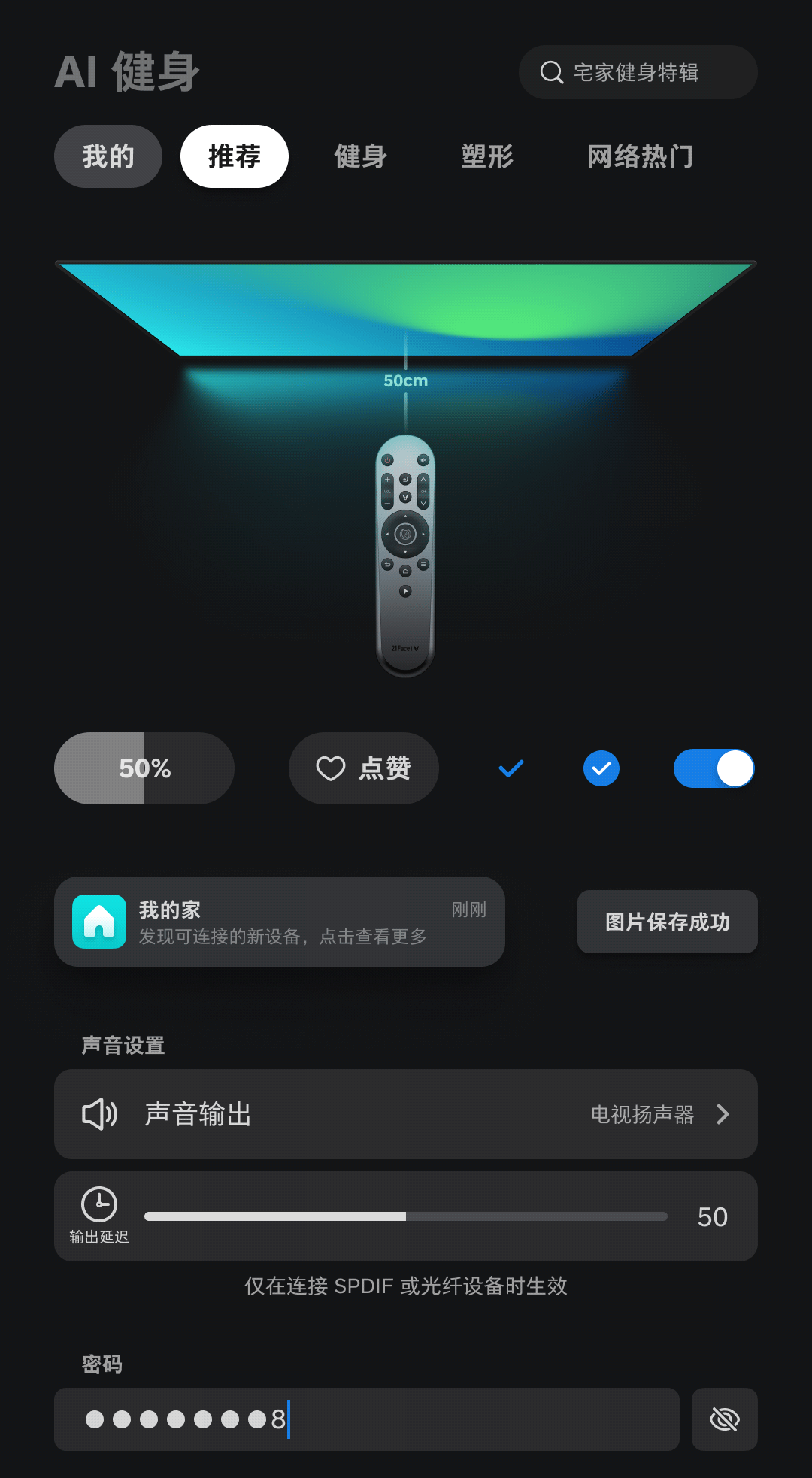
Dark Mode
Directional Key Mode
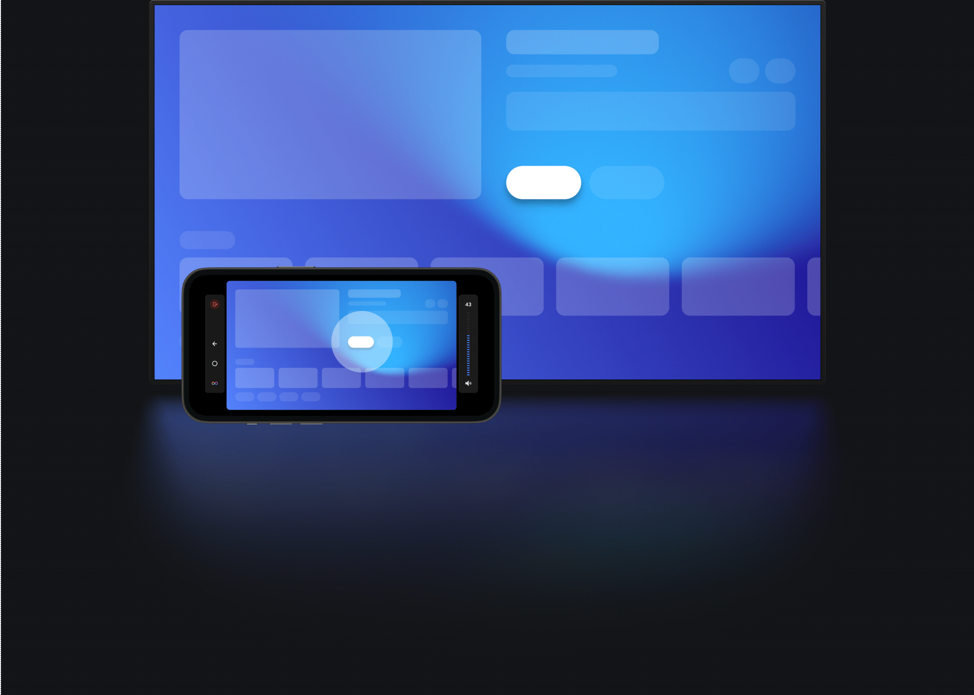
Air Mouse Mode
Landscape and Portrait Modes
And More

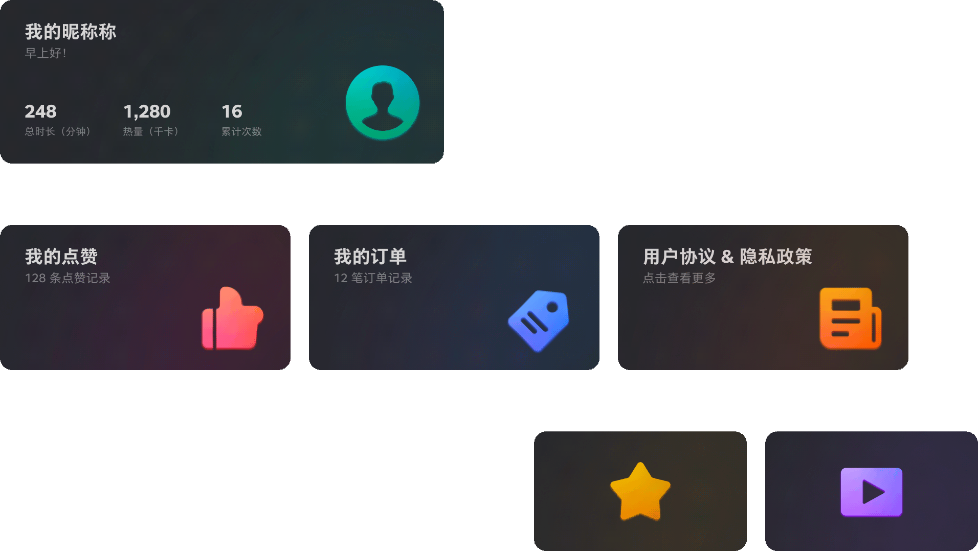
Color
As an important part of the 2.0 upgrade, the support of dark/light modes demands both design and development. By defining system color variables, the system now supports "one-click switching" across all pages.
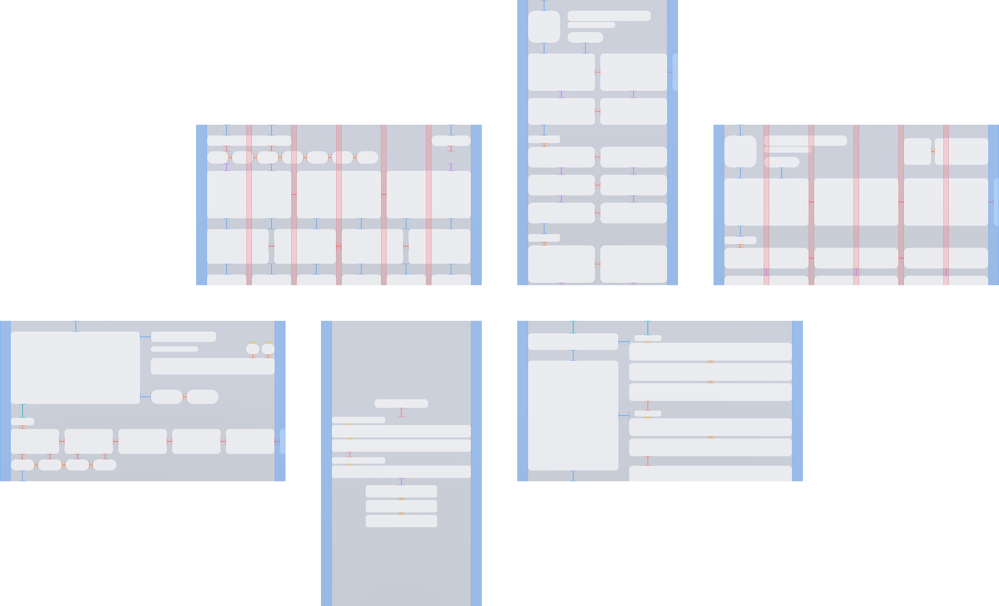
Grid
Adopting a clean, unified grid system ensures logical structure and visual harmony. Appropriately increased spacing prevents interface overcrowding.
More Insights
>>>
|
|---|


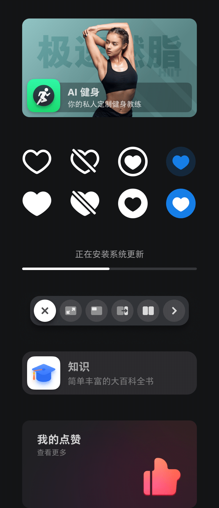
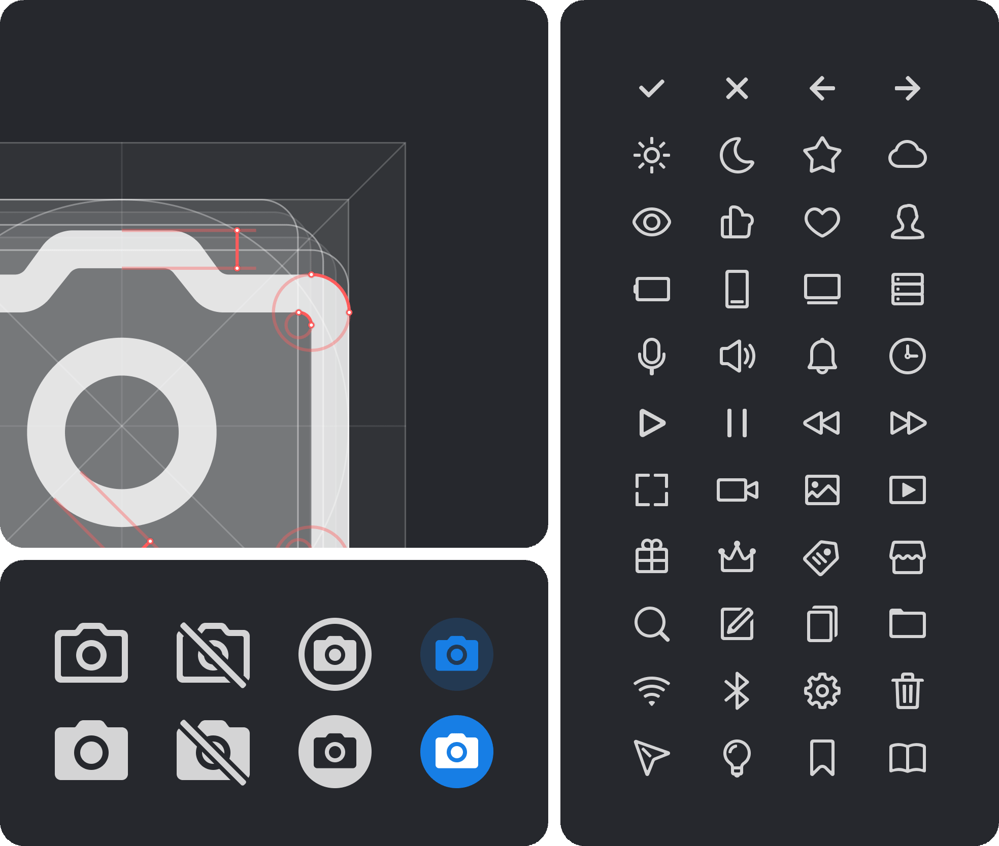
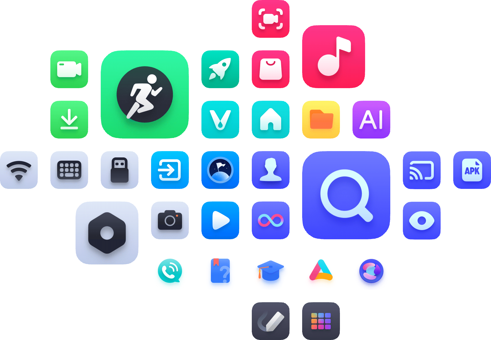
System Icons
Drawing insights from multiple design systems, 200+ icons with a unified design language exclusive to TV projects were made, along with drawing guidelines.
Teamwork
App Icon
Embrace the flat style while retaining the sense of dimension. Collaboratively drew icons for all system apps and modules.
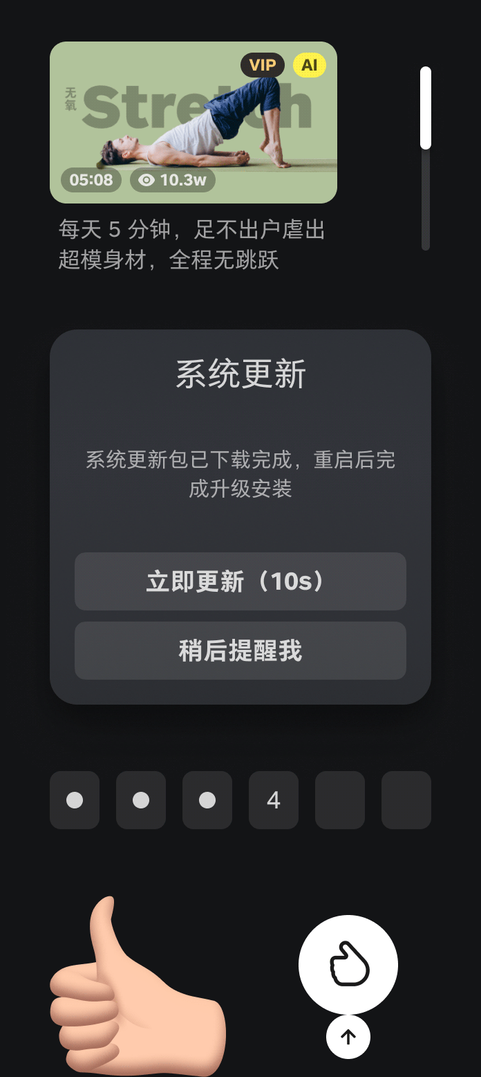
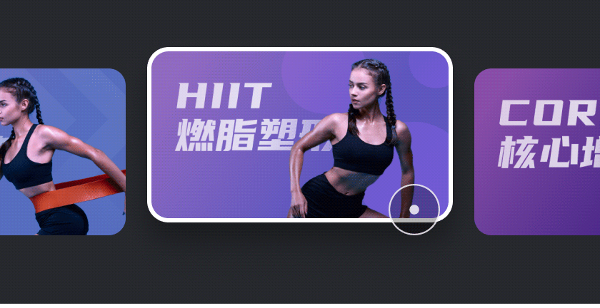
Illustrations and animations
Provide drawing guidelines for devices, characters, decorative icons, and data visualization. Including effects like glow and reflection. Create illustrations and animations that meet the 2.0 style. Color usage should consider both light and dark modes.
|
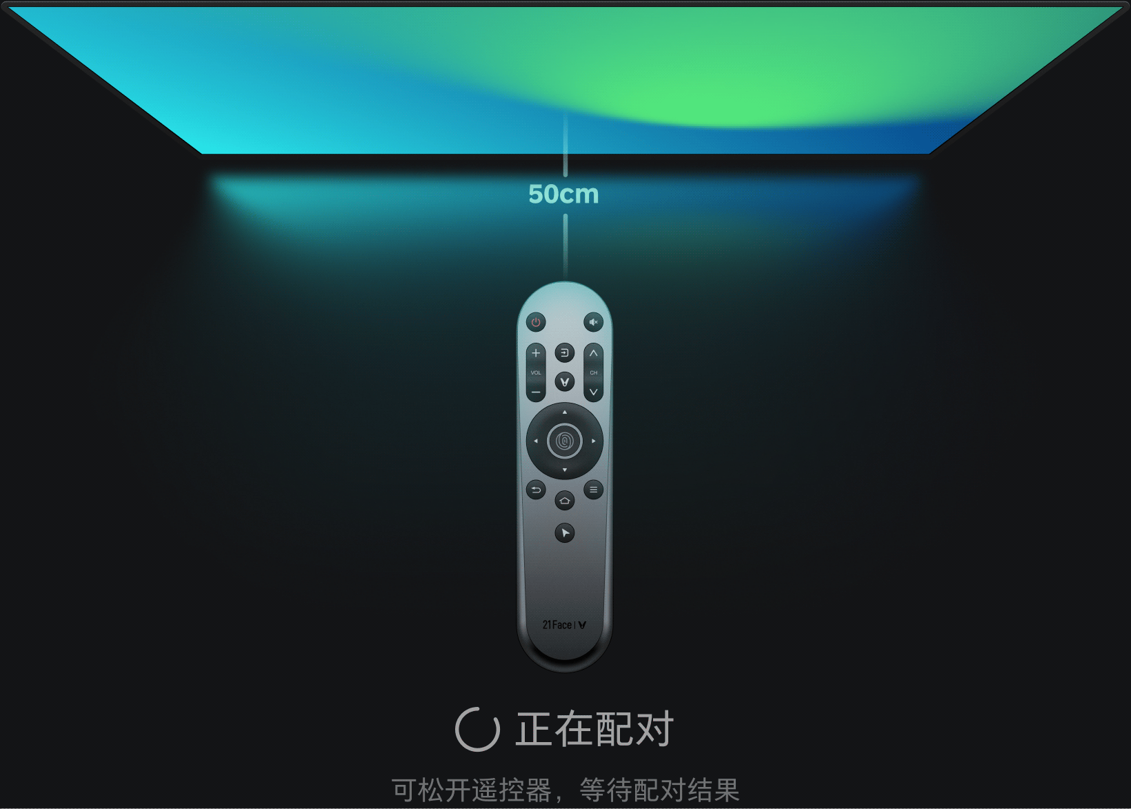
Devices
|
|---|
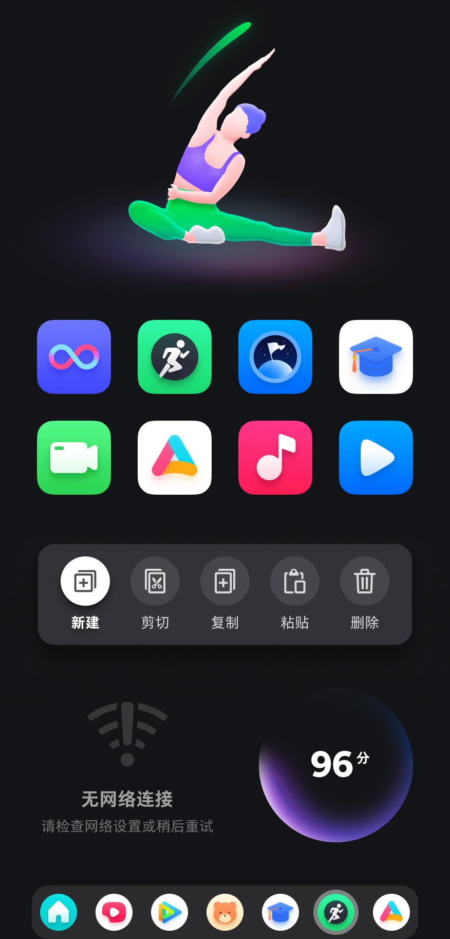
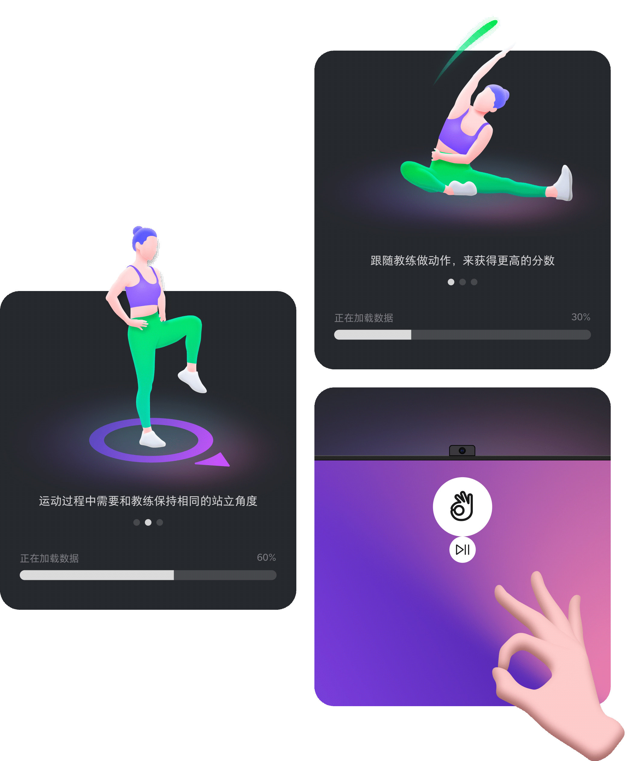
Characters
Include full body movements and gestures, etc.
Decorative Icons
Typically used for functional cards
Data Visualization
Used in TV Manager for Scan, Clean, and Speed Test.
|
|---|
Scan |
 
|
|---|
Health Score |

Speed Test
More Insights
>>>
|
|---|


>>>
|
|---|
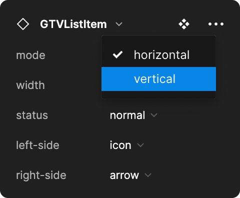

Bridging the Design-Development Component Library
While the UI component library is ready, we didn't stop there. We want to further unify the design and development component libraries. We unified the names of the components on both sides. All components starting with "GTV" can be found in the Development library. An engineer classmate also modified a Figma plug-in that can list all the used system components next to the UI mockups with one click. With the efforts of both teams, communication and development efficiency have been greatly improved, allowing the 2.0 project moves fast and orderly.
