Coze is a next-generation AI app development platform. It supports zero-code building, debugging, and publishing as apps or programs on social media, primarily targeting companies and individual developers.
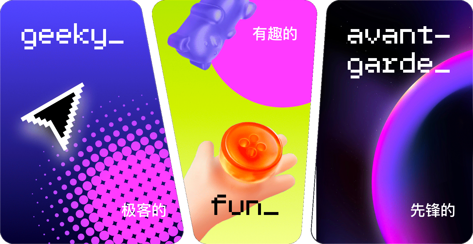
Coze's original design style was very businesslike and formal, lacking a bit of fun and personality. We also want to add a little bit of the geeky vibe.
Moreover, in its early stages, Coze lacked a complete design system, forcing designers to either heavily modify assets from other projects or create everything from scratch. This led to inefficiencies and inconsistencies in the final deliverables.
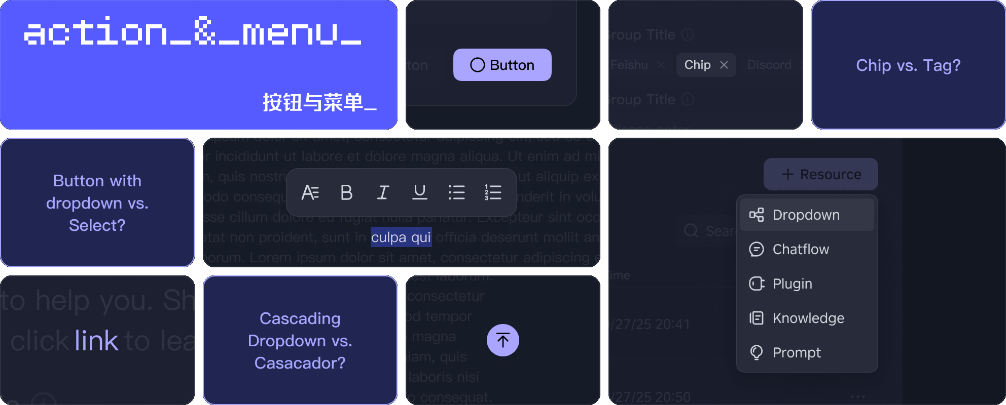
After joining the Coze team, one of my main tasks was to establish and maintain the Coze Design System (including Style, Resource, Component, Pattern, and more), as well as assist other team members as the component person of contact.
Role
Establish and maintain the Coze Design System
Assist other team members in their work
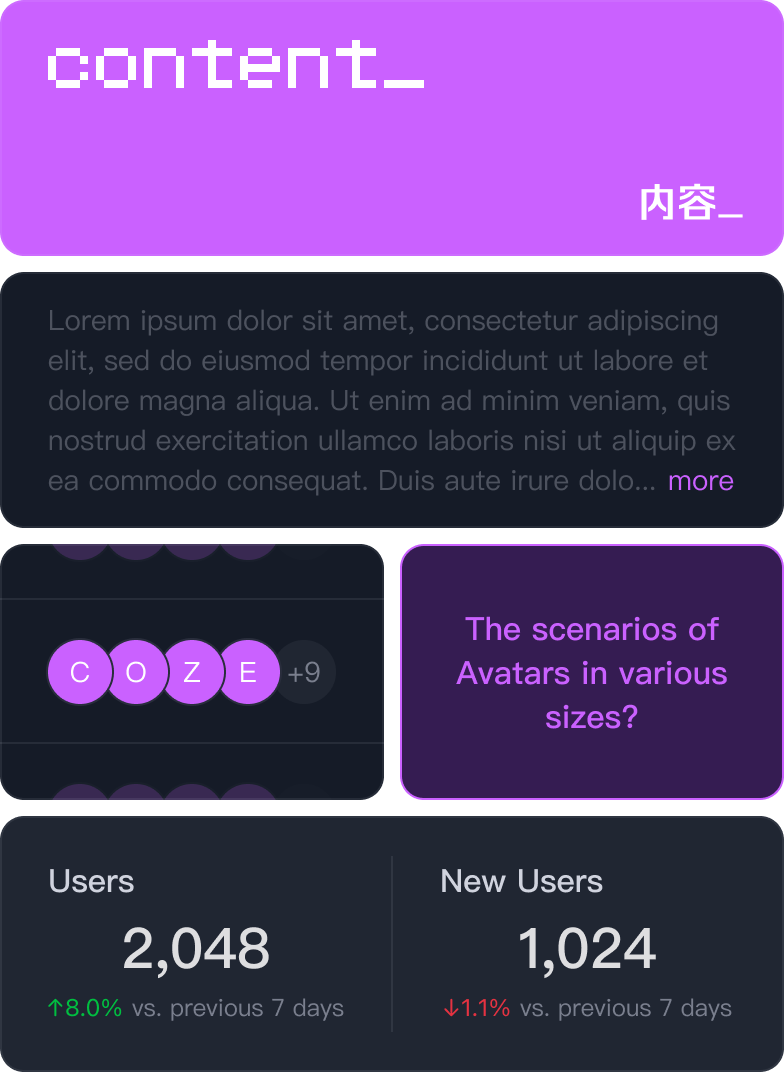
Contents
Style
Resource
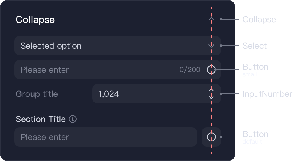
Component
Pattern
Other work
- - - - - - - - - - - - - - - - - - - - - - - - - - - - - - - - -

Color
Since our primary users are developers who frequently work with code, we plan to add a dark mode option alongside the existing light mode. This will utilize color variables to enable "one-click switching" between light and dark modes.
Currently, color variables have covered all designs.
.
Moreover, for different usage scenarios, “high-contrast colors” and “low-contrast colors” is supported.
“High-contrast colors” appear very light in dark mode and very dark in light mode. They are used for neutral text, theme elements, AI elements, etc., ensuring readability.

“Low-contrast colors” appear similar in light and dark modes. They are applied to functional colors (alerts, warnings, success), avatars, charts, etc., ensuring color consistency.

Text
Grenadian text sizes are supported. Additionally, wordings and writing formats are provided based on language, currency, and calendar differences.
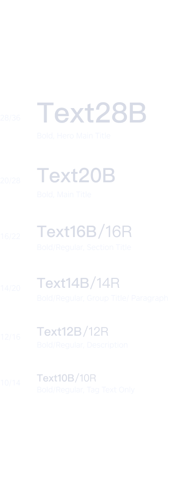
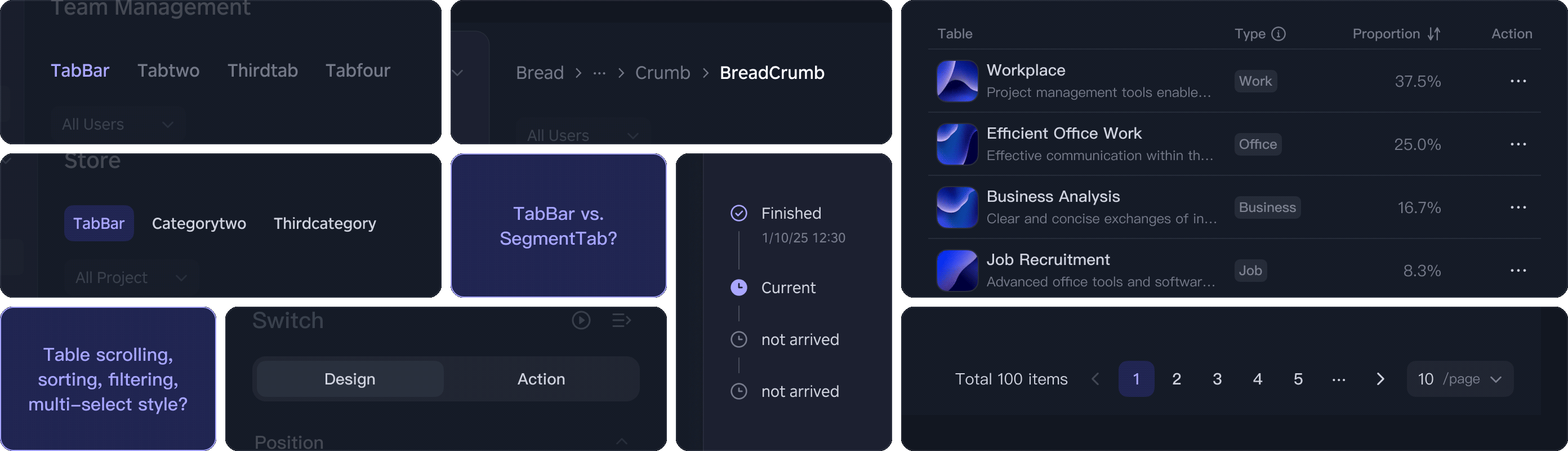
Size and Layout
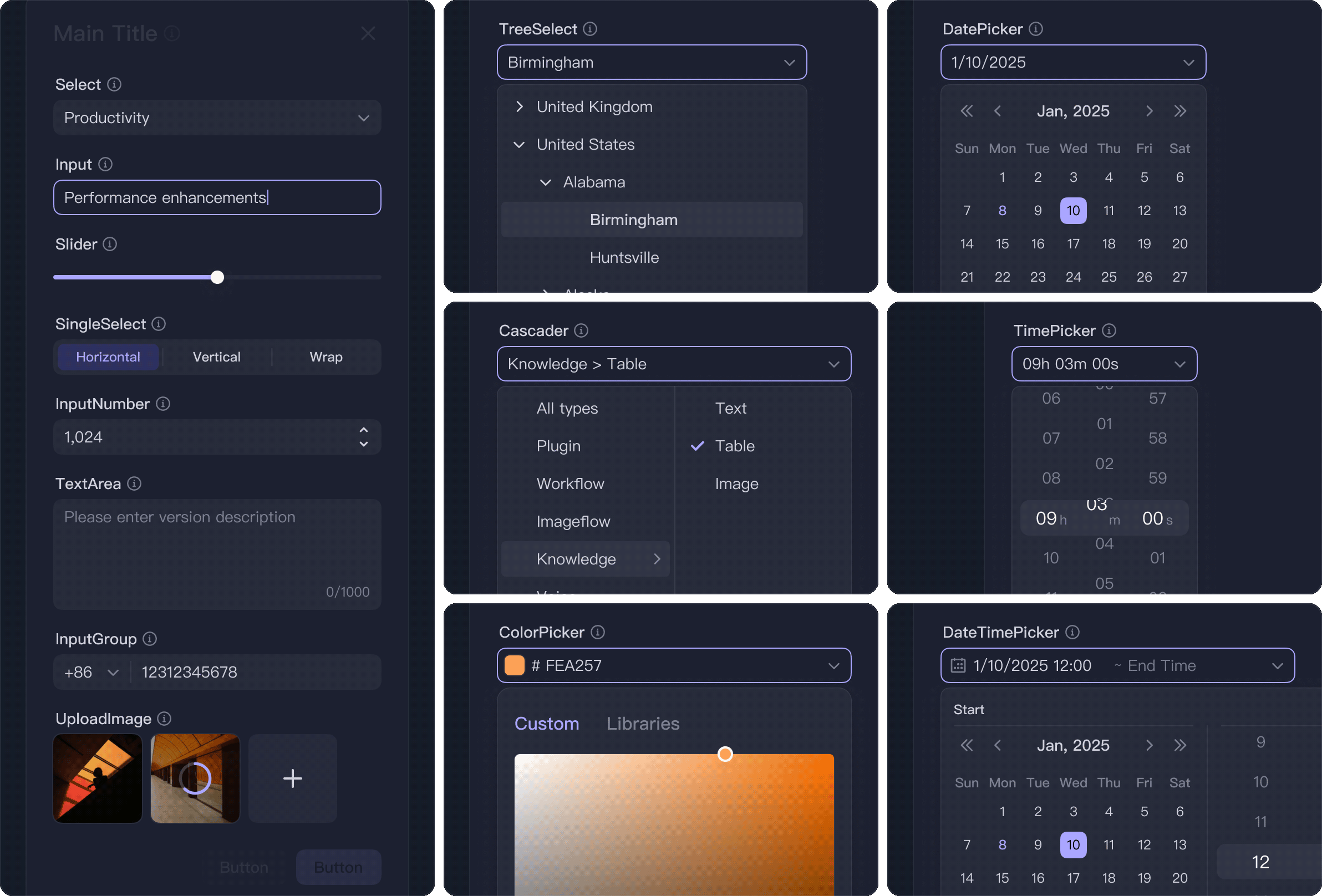
The platform features numerous integrated development environment pages; therefore, the layouts are relatively compact and adopt a Bento-style grid. Additionally, various layout styles, including both fixed and adaptive, are offered.
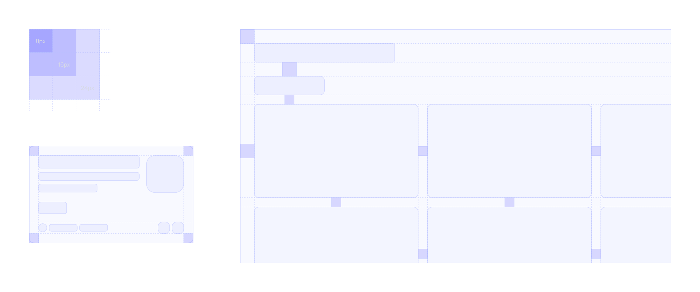
.


